The PS4 menu is cluttered and nothing seems to fit together like it should. I would much prefer if they used the PS3 menu, which also isn't good, but it's passable at least. And it has ads. Ew.
The Xbox One menu suffers from the opposite problem that the PS4 and Xbox 360 menus suffer from- everything is grouped poorly. The Xbox One menu is grouped very strangely, and it doesn't make much sense. It's a bit difficult to navigate with a whole ton of garbage being on every page. It also has ads on it, so ew. It has 4 tabs and a bunch of sidebar stuff. I don't like the sidebar. It's not easy to navigate.
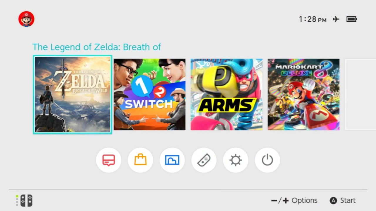
The Switch menu is bland and uninspired. There are only 2 themes and I'm not a fan of the sleep button and settings button being where they are. It only shows 12 games on the home page and you can't set it to show more at once, even though you can do that on the 3DS. The eShop button should be before the message boards, but that's a small gripe. It doesn't have ads on it though, so it at least has one advantage.
Now for some good menus.
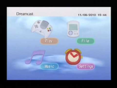
On the Dreamcast, everything is divided into 4 categories that all make sense. If you have a game, run the game. If you have a CD, play the CD. You can also do stuff on the memory card or check settings. Everything is well-animated, and it also tells the time and date in case you don't have a calendar. The background is nice, and there's another theme if you press start while bootup with a Puyo Puyo Fever save on your VMU. It's pretty neat.
The GameCube Menu is set up in a similar way, but it makes calendar settings its own menu and removes the CD option. Not as nice, but it's simple and clean. It also fits well with the cube theme.
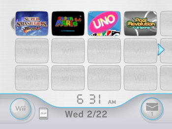
The Wii menu has a very clean and neat organization system. All the games and apps are in windows, and everything else you need is down below. If you have games on an SD Memory Card, there is a separate menu. I wish there weren't, but it helps with organization. Notifications are on the right and settings/memory are on the left. I don't mind that memory is included with settings. It sort of fits, actually. The motion controller makes navigating this menu really easy- with a standard controller, a UI like this might be annoying or frustrating to navigate. But due to the speed and versatility you get with a Wii Remote, it's pretty good.
So why is it like this? I don't know, but my guesstimate is that consoles do so much now that don't fit well with anything involved with gaming, so they just throw it in wherever. That's just a hunch though.
I don't know how to end this post, so goodbye